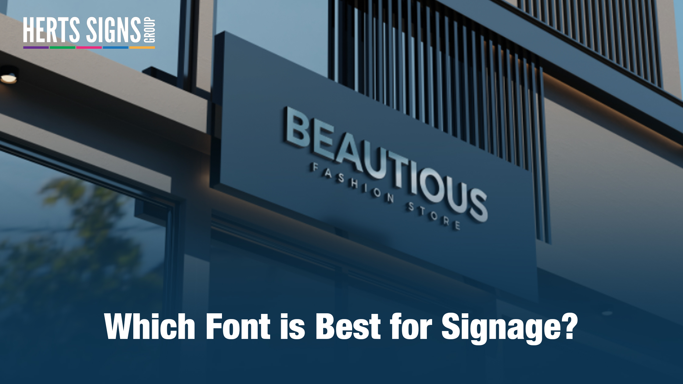
When it comes to creating impactful signage, there's more to consider than just the design and message. One crucial aspect often overlooked is the choice of font. At Herts Signs, your trusted signage manufacturer Hertfordshire, we understand the importance of selecting the right font for your signs. Let's dive into the world of typography and discover which fonts work best for signage printing and design services in Hertfordshire.
1. Legibility is Key
The primary purpose of any sign is to convey a message clearly and effectively. Hence, legibility is paramount. Opt for fonts that are easy to read from a distance. Simple, sans-serif fonts like Arial and Helvetica are excellent choices for this purpose. They offer a clean and modern look, making your message instantly accessible to passersby.
2. Consider the Environment
The environment where your signage will be displayed matters. For outdoor signs, you need fonts that can withstand the elements and remain visible in various weather conditions. Bold and thick fonts, such as Impact or Futura, work well in outdoor settings, ensuring your message remains prominent even in adverse weather.
3. Reflect Your Brand
Your signage should be an extension of your brand identity. The font you choose should align with your brand's personality and values. For a law firm or a financial institution, a classic and formal font like Times New Roman or Baskerville may be appropriate. In contrast, a creative agency might opt for a more playful and unique font like Comic Sans to showcase their creativity.
4. Avoid Overly Decorative Fonts
While decorative fonts can be visually appealing, they often sacrifice legibility. It's best to avoid overly ornate or cursive fonts, especially for signage that needs to convey important information quickly. These fonts can confuse viewers and detract from the message you want to communicate.
5. Maintain Consistency
If you have multiple signs, it's essential to maintain font consistency. Consistency not only reinforces your brand identity but also makes it easier for people to recognize your signage. Stick to a select few fonts that align with your brand and use them consistently across all your signage.
6. Test Before Printing
Before finalising your signage design, it's crucial to test how your chosen font looks in the actual size and format. What appears clear on a computer screen may not translate the same way on a sign. Make sure your font choice remains legible and visually appealing in the real-world context.
At Herts Signs, we offer signage printing and design services in Hertfordshire that cater to your specific needs. Whether you're looking for indoor or outdoor signage, our team of experts will guide you in choosing the perfect font to make your message stand out.
In conclusion, the best font for signage depends on several factors, including legibility, the environment, and brand identity. By carefully considering these aspects and seeking professional guidance, you can ensure that your signage effectively communicates your message to your target audience. Choose Herts Signs as your signage manufacturer in Hertfordshire, and let us help you create visually appealing and impactful signage that leaves a lasting impression.
contact us to discuss signage requirements!


